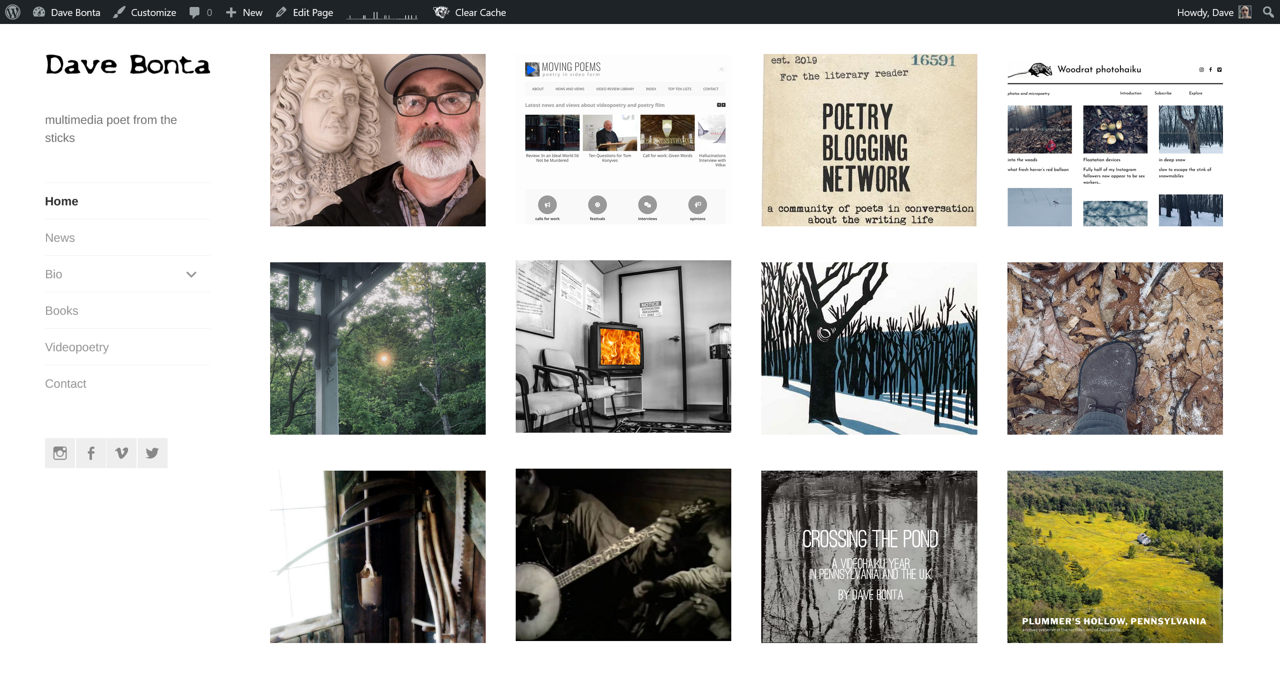
Some weirdness during the update to a new WordPress version today, in which the front page content wouldn’t show until I monkeyed around with the database, caused me to give the page a critical look when I did finally get it back. The problem is, with the 17″ laptop screen I’m using these days, the project thumbnails go four across rather than three, as on my notebook, and I only had nine of them. Time to add three more, which wasn’t hard: I’d never had one for Moving Poems (d’oh!), the Plummer’s Hollow website, or my half-hour compilation of videohaiku, Crossing the Pond. Fixed.
I do still really like this approach to an author site. Writers who focus mainly on traditional publication can get by with a simple biography plus books list, and I envy that. But I’ve always divided my time between different kinds of pursuits and I like representing that visually in a way that suggests order and balance when in reality, of course, chaos prevails.

When I first started thinking about a redesign of this site, back around 2017, I pictured a front page with a large single image of me in the woods. The problem with such images is that they include many, many pixels; it’s hard to scale down a forest shot so it loads quickly. But for some reason I thought I needed visual unity, and I was even prepared to capitulate to society’s focus on the poet rather than the poetry, which I’d always resisted. Now I’m glad I dragged my feet on that, because I like this slight decentering of the author on his own page. There are many things that matter to me, and here are some of them.
I’m no Whitman, but I do embrace a small multitude. We converse daily.